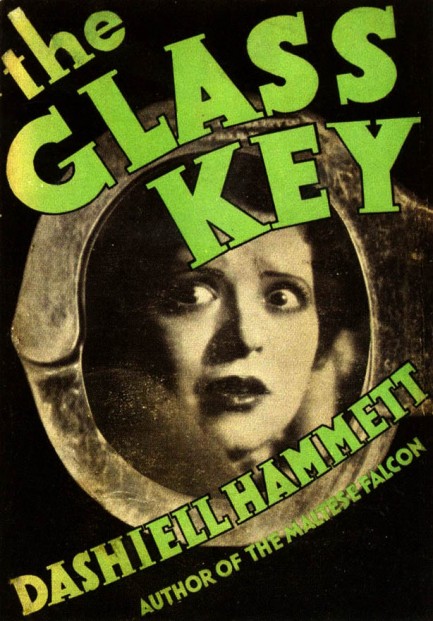
| Vintage Pulp | Aug 1 2013 |

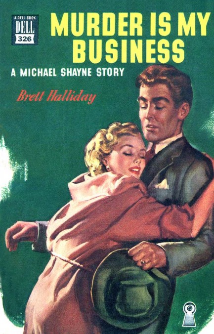
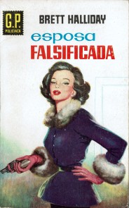
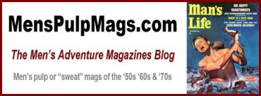
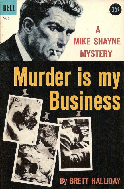
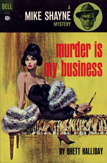
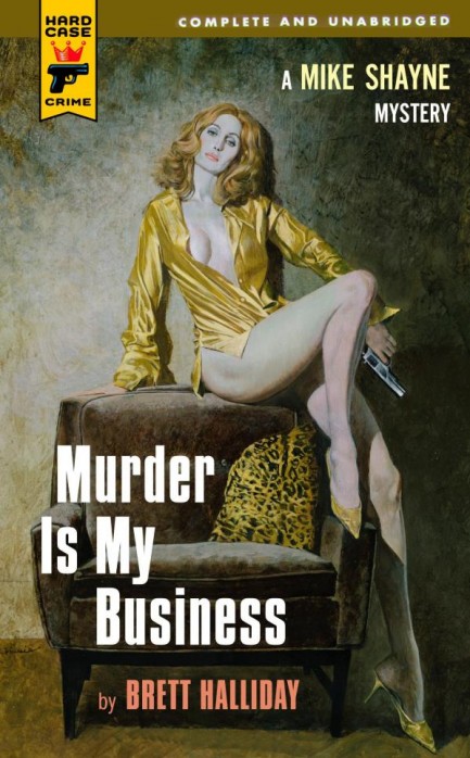
In a down job market you take what you can get, especially if it makes your woman this happy. This cool cover for Brett Halliday’s Murder Is My Business was painted by William George for Dell Publishing in 1949. Halliday was reprinted a bunch, so there are multiple covers for this book. The one just below is the original hardback from 1945, and after that, in order, are the 1945 paperback by Gerald Gregg, a photorealistic 1958 cover, a 1963 Robert McGinnis cover, and lastly, the recent Hard Case Crime version with Robert McGinnis cover art once again. There are others, as well, but we couldn’t track them all down.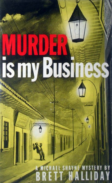


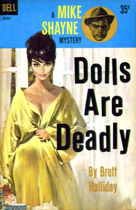
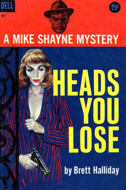
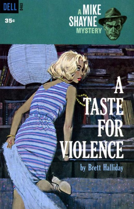
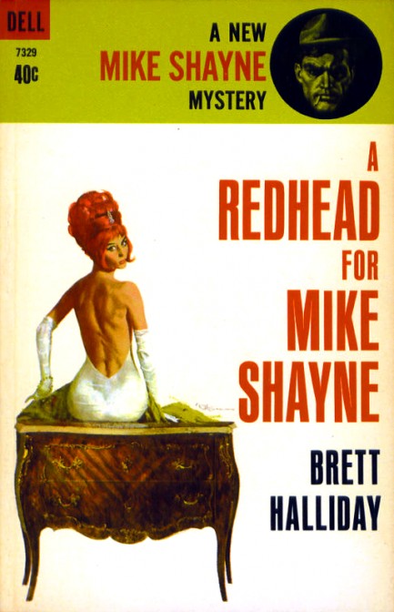
| Vintage Pulp | Nov 17 2010 |

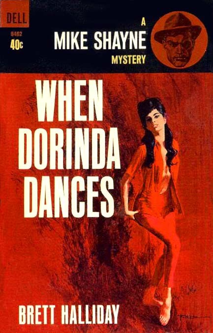
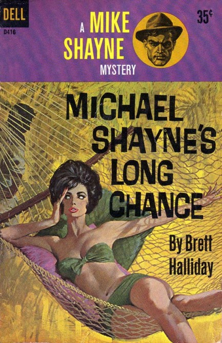
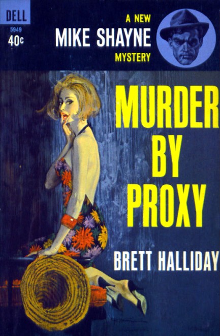
Below, nine Robert McGinnis covers for Brett Halliday’s, née Davis Dresser’s, Mike Shayne series, featuring his trademark femmes fatales, 1943 through 1964.

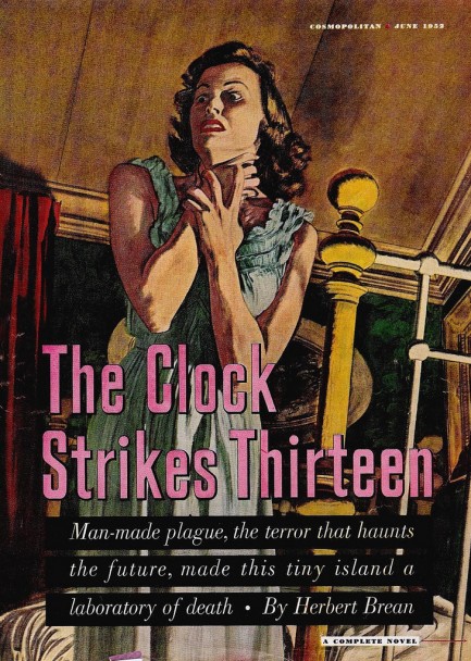
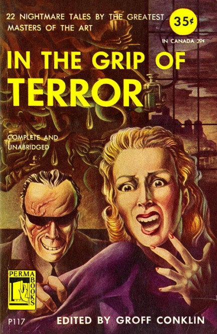
| Vintage Pulp | Aug 9 2010 |

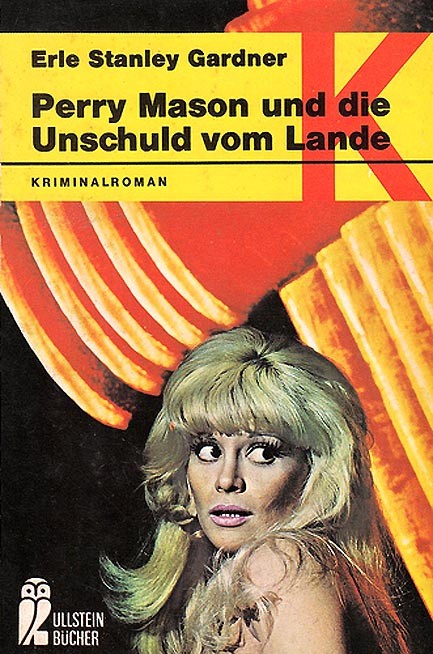
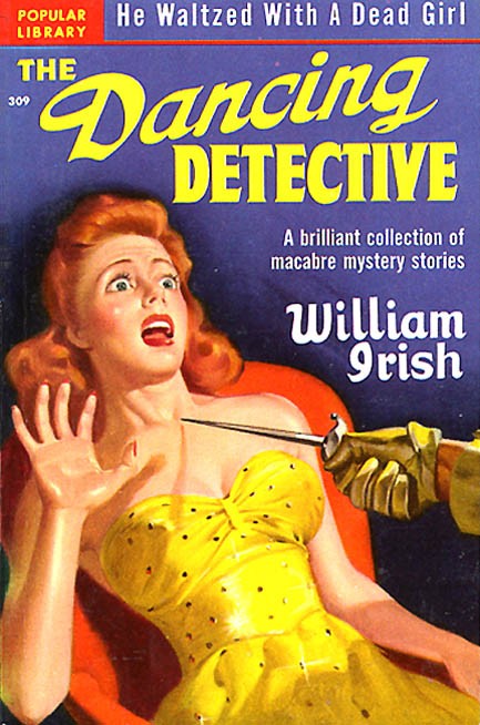
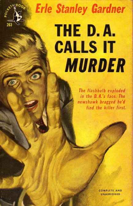
Below, fifteen pieces of pulp art with terror as their central theme. The cover in panel three from Erle Stanley Gardner is the German version of 1948's Perry Mason and the Case of the Vagabond Virgin, retitled Perry Mason und die Unschuld vom Lande, or Perry Mason and the Innocence of the Country.


| Vintage Pulp | Sep 24 2009 |

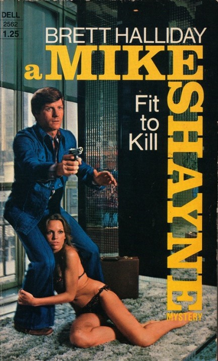
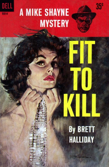
Does the cover of Brett Halliday’s Fit To Kill look like a really stiff and lifeless museum diorama of the 1970s, or is it our imagination? Can’t you just hear a guide now, describing ancient and mystifying artifacts such as mirrored walls, crocheted carpets, and boat shoes? The ’70s gave us a lot of good things—the microwave oven, The Exorcist, liposuction—but denim leisurewear is not one of them. Let’s hope for everyone’s sake it isn’t bad guys that are after our hero, but the fashion police.

| Modern Pulp | Apr 11 2009 |

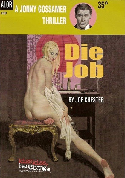
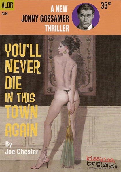
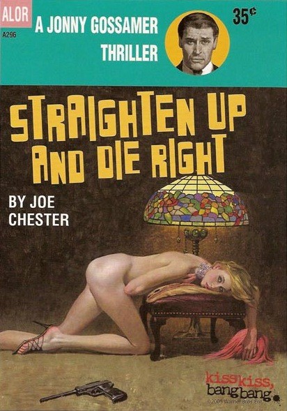
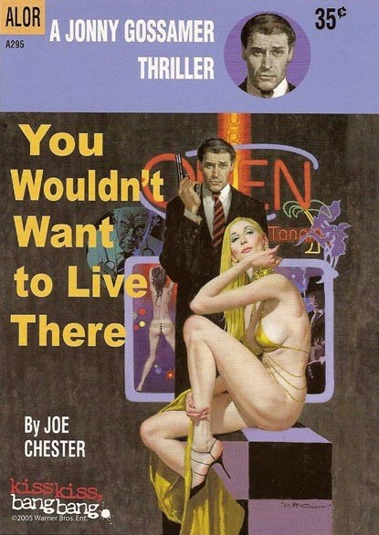
No, these aren’t pulp classics that somehow escaped your notice. They’re props from the 2005 film Kiss Kiss, Bang Bang, in which Robert Downey, Jr. played a thief accidentally cast in a Hollywood film. The movie was based on Brett Halliday’s pulp novel Bodies Are Where You Find Them, and so the producers of the film mocked up four pieces of faux fiction as a sort of tribute, and used Robert McGinnis art to do so. The paintings are of course wonderful, but to our eyes the overall designs aren’t fully convincing. This is mainly due to the uninspired font choices and rather limp colors utilized for the overall graphics. One gets the sense the designers didn’t have a true affinity for pulp style. But even if the covers are less than authentic, the McGinnis art is still to die for.